After collecting a large number of sample data, we often need to use some statistics to describe the central tendency and dispersion of the data, and summarize the overall characteristics of the data through these indicators.
Describing Central Tendency
Statistics describing the central tendency of sample data include arithmetic mean, median, geometric mean, harmonic mean, trimmed mean, mode, and quantiles.
Arithmetic Mean The arithmetic mean of sample data
is defined as:
Median The median is the value in the middle position after sorting the sample data from smallest to largest.
Geometric Mean The geometric mean
of sample data
can be calculated as:
Harmonic Mean The harmonic mean
of sample data
is defined as:
Trimmed Mean After sorting the sample data, remove extreme values from both ends, then calculate the arithmetic mean of the remaining data to get the trimmed mean.
Mode The mode is the value that appears most frequently in the sample data. If there are no repeated values, the mode is 0.
Quantiles The value at the
position after sorting the sample data from smallest to largest is called the
quantile. The median is the 50% quantile.
There is a bag of candies, and 16 bags are randomly selected to weigh their weights, as shown in Column A of the worksheet in Figure 6-1. We need to calculate the arithmetic mean, geometric mean, harmonic mean, trimmed mean, median, mode, and 25% quantile of the data.
Excel currently has at least two ways to calculate these statistics: using Excel functions or using built-in Python. First, we introduce calculation using Excel functions.
As shown in Figure 6-1, enter the following formula in cell D2: =AVERAGE($A$1:$A$16)
In cell D3, enter: =GEOMEAN($A$1:$A$16)
In cell D4, enter: =HARMEAN($A$1:$A$16)
In cell D5, enter: =TRIMMEAN($A$1:$A$16)
In cell D6, enter: =MEDIAN($A$1:$A$16)
In cell D7, enter: =MODE($A$1:$A$16)
In cell D8, enter: =PERCENTILE($A$1:$A$16,0.25)
In cell D9, enter: =QUARTILE($A$1:$A$16,1)
The calculation results are shown in Figure 6-1.

Figure 6-1 Calculating Central Tendency Statistics Using Excel Functions
Next, we use Excel’s built-in Python for calculation.
As shown in Figure 6-2, first enter =PY( in cell D2 to enter Python mode, then input the following code in the formula bar:
data = xl("$A$1:$A$16").values
np.mean(data)
Press Ctrl+Enter to return a scalar value representing the arithmetic mean.
Similarly, for cell D3, input the following code in Python mode:
from scipy import stats as st
data = xl("$A$1:$A$16").values
gm = st.gmean(data)
gm
Press Ctrl+Enter to return the geometric mean.
For cell D4, input:
from scipy import stats as st
data = xl("$A$1:$A$16").values
hm = st.hmean(data)
hm
Press Ctrl+Enter to return the harmonic mean.
For cell D5, input:
from scipy import stats as st
data = xl("$A$1:$A$16").values
tm = st.tmean(data)
Press Ctrl+Enter to return the trimmed mean.
For cell D6, input:
data = xl("$A$1:$A$16").values
np.median(data)
Press Ctrl+Enter to return the median.
For cell D7, input:
from scipy import stats as st
data = xl("$A$1:$A$16").values
md = st.mode(data)
md
Press Ctrl+Enter to return the mode.
For cell D8, input:
from scipy import stats as st
data = xl("$A$1:$A$16").values
st.scoreatpercentile(data, 25)
Press Ctrl+Enter to return the 25% quantile.
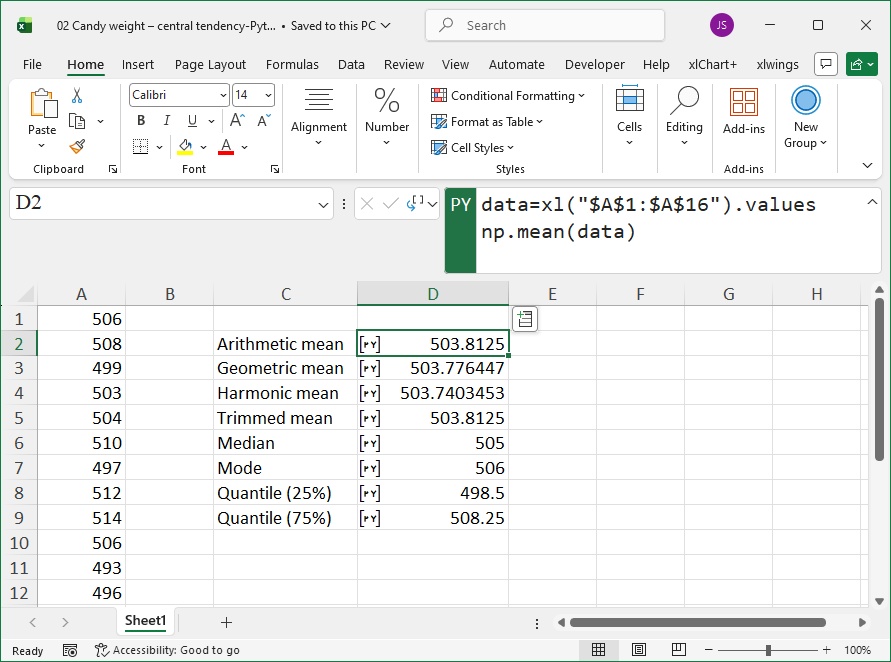
Figure 6-2 Calculating Central Tendency Statistics Using Excel’s Built-in Python
Describing Dispersion
Statistics describing the dispersion of sample data include range, variance, standard deviation, mean absolute deviation (MAD), interquartile range (IQR), and coefficient of variation.
Range The range is the difference between the maximum and minimum values in the sample data.
Variance The variance of sample data
is defined as:
where
represents the sample mean.
Standard Deviation The standard deviation of sample data
is defined as:
where
is the sample variance.
Mean Absolute Deviation (MAD) MAD is the mean of the absolute values obtained by subtracting the sample mean from each data point.
Interquartile Range (IQR) IQR is the difference between the 75% and 25% quantiles after sorting the sample data.
Coefficient of Variation The coefficient of variation is the ratio of the sample standard deviation to the mean, usually expressed as a percentage.
Using the same data as for central tendency, we calculate the range, variance, standard deviation, MAD, IQR, and coefficient of variation. First, we use Excel functions.
As shown in Figure 6-3, enter the following formula in cell D2: =MAX($A$1:$A$16)-MIN($A$1:$A$16)
In cell D3, enter: =VAR($A$1:$A$16)
In cell D4, enter: =STDEV($A$1:$A$16)
In cell D5, enter: =AVERAGE(ABS($A$1:$A$16-AVERAGE($A$1:$A$16)))
In cell D6, enter: =QUARTILE($A$1:$A$16,3)-QUARTILE($A$1:$A$16,1)
In cell D7, enter: =STDEV($A$1:$A$16)/AVERAGE($A$1:$A$16)
The calculation results and their meanings are shown in Figure 6-3.
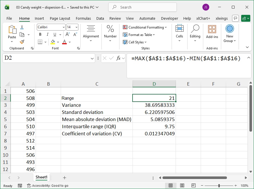
Figure 6-3 Calculating Dispersion Statistics Using Excel Functions
Next, we use Excel’s built-in Python.
As shown in Figure 6-4, for cell D2, input the following code in Python mode:
data = xl('$A$1:$A$16').values
np.ptp(data)
Press Ctrl+Enter to return the range.
For cell D3, input:
from scipy import stats as st
data = xl('$A$1:$A$16').values
st.tvar(data, ddof=1)
Press Ctrl+Enter to return the variance.
For cell D4, input:
from scipy import stats as st
data = xl('$A$1:$A$16').values
st.tstd(data, ddof=1)
Press Ctrl+Enter to return the standard deviation.
For cell D5, input:
data = xl('$A$1:$A$16').values
np.mean(np.abs(data - np.mean(data)))
Press Ctrl+Enter to return MAD.
For cell D6, input:
from scipy import stats as st
data = xl('$A$1:$A$16').values
st.iqr(data)
Press Ctrl+Enter to return IQR.
For cell D7, input:
from scipy import stats as st
data = xl('$A$1:$A$16').values
st.tstd(data) / st.tmean(data)
Press Ctrl+Enter to return the coefficient of variation.
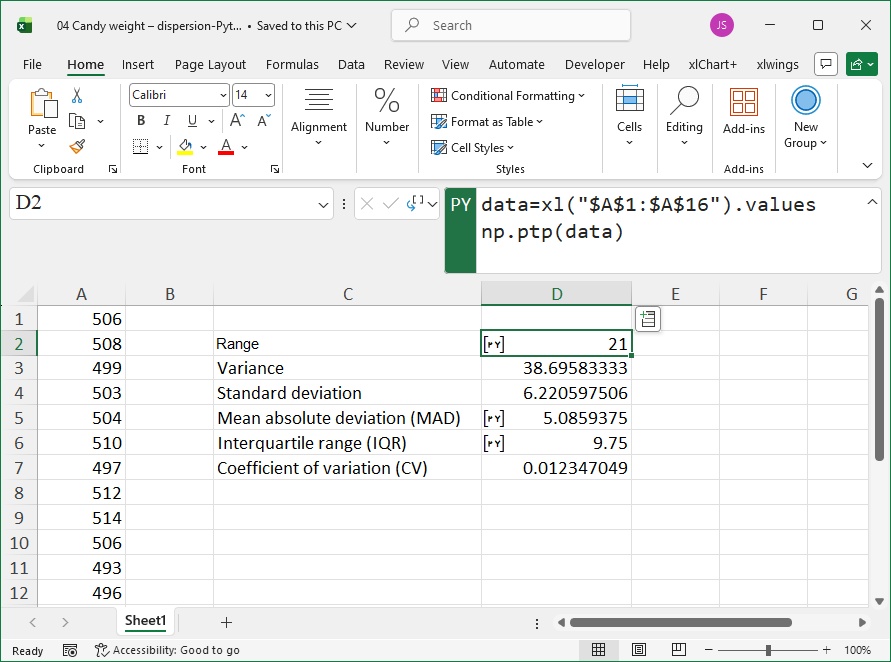
Figure 6-4 Calculating Dispersion Statistics Using Excel’s Built-in Python
Describing Shape
For a given one-dimensional array of data, kurtosis and skewness can describe the shape of the data, i.e., whether it is tall and thin, short and fat, left-skewed, or right-skewed.
Using the same data as for central tendency, we calculate kurtosis and skewness. First, we use Excel functions.
As shown in Figure 6-5, enter the following formula in cell D2: =SKEW($A$1:$A$16)
In cell D3, enter: =KURT($A$1:$A$16)
The calculation results and their meanings are shown in Figure 6-5.

Figure 6-5 Calculating Kurtosis and Skewness Using Excel Functions
Next, we use Excel’s built-in Python.
As shown in Figure 6-6, for cell D2, input the following code in Python mode:
from scipy import stats as st
data = xl('$A$1:$A$16').values
st.kurtosis(data, bias=False)
Press Ctrl+Enter to return kurtosis. Note: bias=True represents population kurtosis, and bias=False represents sample kurtosis.
For cell D3, input:
from scipy import stats as st
data = xl('$A$1:$A$16').values
st.skew(data, bias=False)
Press Ctrl+Enter to return skewness.
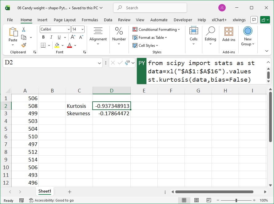
Figure 6-6 Calculating Kurtosis and Skewness Using Excel’s Built-in Python
Grouped Statistics
In work, we often need to group data by the values of a specified variable and then calculate statistics for each group. In Python, we can use the groupby method of DataFrame objects to group data, then use statistical functions to analyze each group.
In the worksheet shown in Figure 6-7, cells A1:E10 contain salary data for employees in different departments. We need to calculate the average salary for each department.
In cell G2, input the following code in Python mode:
df = xl("A1:E10", headers=True)
r = df.groupby('Department')['Galary'].agg('mean')
Press Ctrl+Enter to return a Series object, where each element is the average salary of a department. The agg method specifies the 'mean' parameter to calculate the average salary for each department.
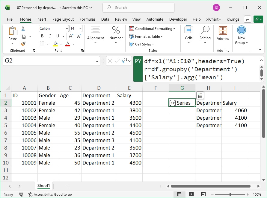
Figure 6-7 Grouped Statistics
Frequency Analysis
Frequency analysis first sorts the given data from smallest to largest, then bins the data sequence according to the minimum and maximum values (i.e., divides it into equal intervals) to get the start and end values of each bin, and finally counts the number of original data points falling into each bin. Frequency analysis helps explore the distribution of data.
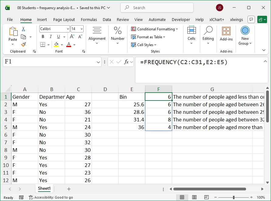
Figure 6-8
The personnel distribution of a training class is shown in columns A-C of the worksheet in Figure 6-8, with indicators including unit (whether internal), gender, and age. We perform frequency analysis on this data.
First, we use Excel functions. Enter the bin boundary ages in column E. To align with the Python results, set the boundary ages as shown in column E of Figure 6-8. Using 4 boundaries divides the data into 5 intervals.
In cell F1, enter the formula: =FREQUENCY(C2:C31,E2:E5)
Press Enter to get the results in cells F1:F5. Column G explains the results. For example, the value 6 in cell F1 means 6 people are aged ≤25.6 years.
Next, we use Excel’s built-in Python.
As shown in Figure 6-9, for cell E2, input the following code in Python mode:
df = xl("A1:C31", headers=True)
ser = df['Age'].sort_values()
cut = pd.qcut(ser, 5)
freq = cut.value_counts(sort=False)
Press Ctrl+Enter to return a Series object, where each element is the frequency of data in each interval (consistent with Figure 6-8).
For cell E9, input:
cut.unique()[0].leftPress Ctrl+Enter to return the lower bound of the first interval.
For cell F9, input:
cut.unique()[0].rightPress Ctrl+Enter to return the upper bound of the first interval.
Similarly, for cells E10-E13, input corresponding code to get the lower bounds of other intervals; for cells F10-F13, input code to get the upper bounds of other intervals.
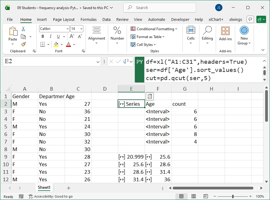
Figure 6-9 Frequency Analysis Using Excel’s Built-in Python
Pivot Tables
Pivot tables facilitate data summarization. In the worksheet shown in Figure 6-10, columns A-D contain data on the basic salary and net salary of employees in different departments. We need to summarize the data: first, use a pivot table to calculate the average net salary per department; second, use a pivot table to calculate the total net salary per department and the cumulative sum of net salaries across departments. In Python, we use the pivot_table function from the pandas package to create pivot tables.
For cell F1, input the following code in Python mode:
df = xl("A1:D23", headers=True)
pt = pd.pivot_table(df, values='Net Salary', index=['Department'])
Press Ctrl+Enter to return a DataFrame object. The average net salary per department is shown in cells G1:H5 of Figure 6-10. The code specifies the pivot table values as net salary and the row index as department. By default, the aggregation function is mean.
To calculate the total net salary per department and the cumulative sum, for cell F7, input:
pt = pd.pivot_table(df, values=''Net Salary'', index=['Department'], aggfunc=sum, margins=True, margins_name='Total')Press Ctrl+Enter to return a DataFrame object. The total net salary per department and the cumulative sum are shown in cells G7:H12 of Figure 6-10. The code specifies the aggregation function as sum (summation), margins=True (display column totals), and margins_name='总计' (label for the total row).
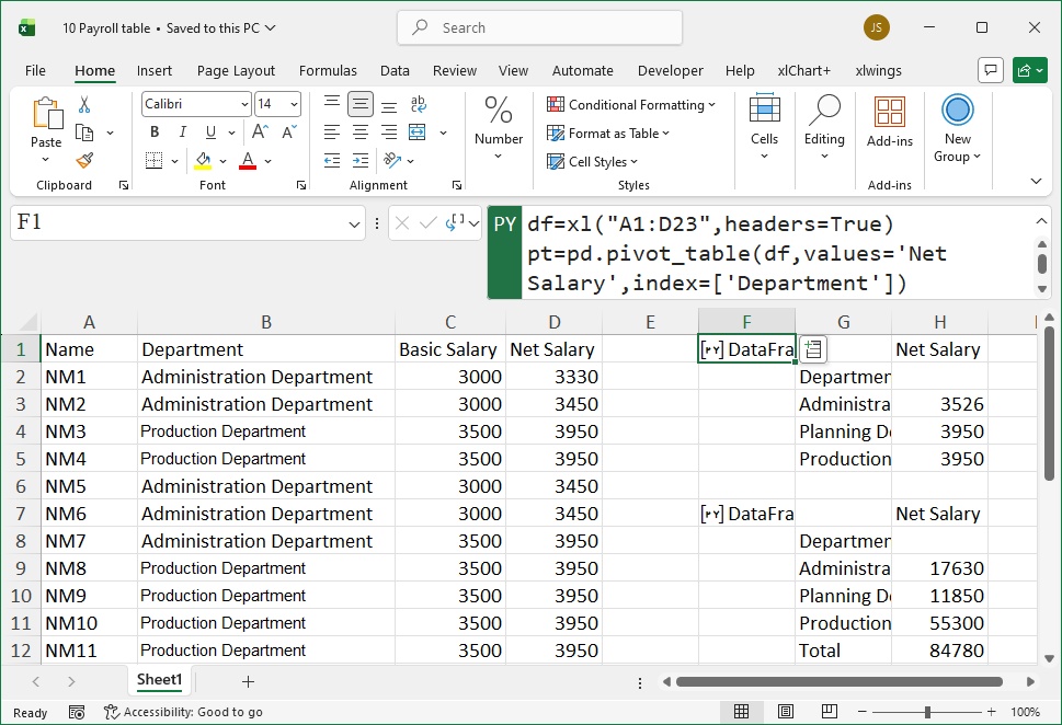
Figure 6-10 Pivot Tables